• Home
  • Portfolio
    • Work
    • Resume
    • Linked In
  • shop
  • Contact
    • about
    • send a message
    • Social
      • Linked In
      • Instagram
      • Pinterest

CINDY LACKEY

DESIGNER

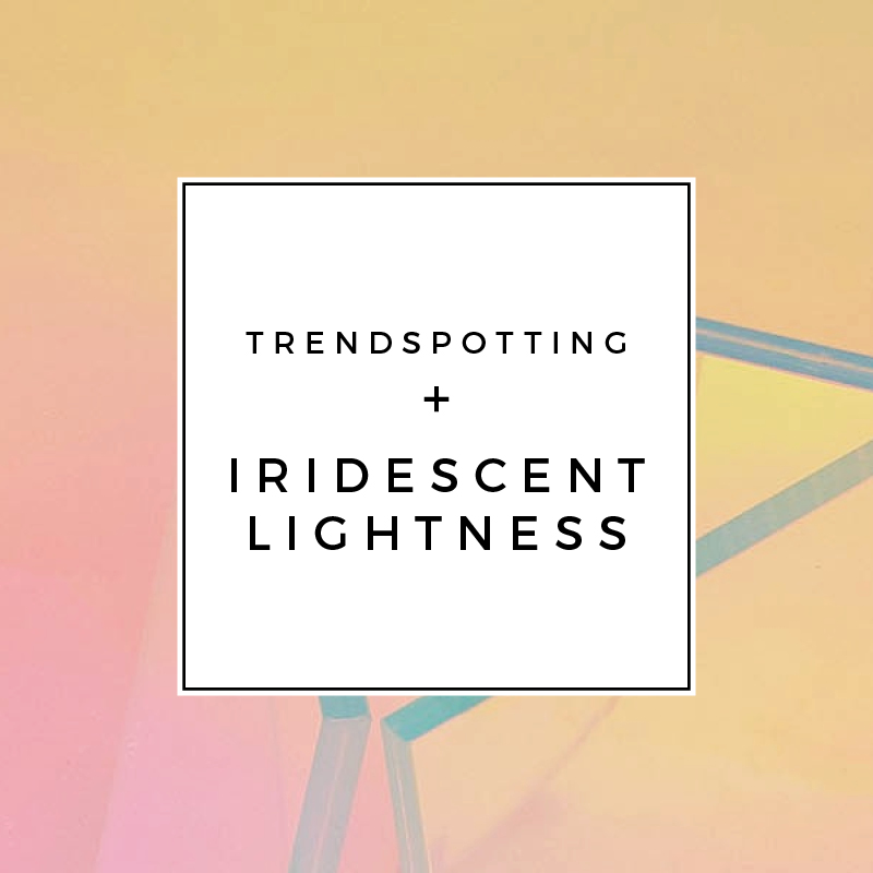
Trendspotting + Iridescent Lightness

Unicorns and happiness! It’s not just iridescent darkness that’s trending, lightness is also popping up everywhere in a big way from fashion to DIY to furniture. So cheer up and get your sparkle on!

25-04-2016_Trendspotting+Iridescence_light

iridescent kite / Quantum Field X3 by Hiro Yamagata for the Guggenheim Museum Bilbao, Spain in 2004 / Glas Italia Shimmer Side Table / A Beautiful Mess vase DIY / cutlery from Zara Home / backpack / Studio DIY, Lisa Frank Markie the Unicorn costume / Tropicalia Chair by Patricia Urquiola

Also, if you don’t know about Maria Marie you gotta go check out her site, especially her Pantone collection which is so joyfully lovely. Happy Wednesday!
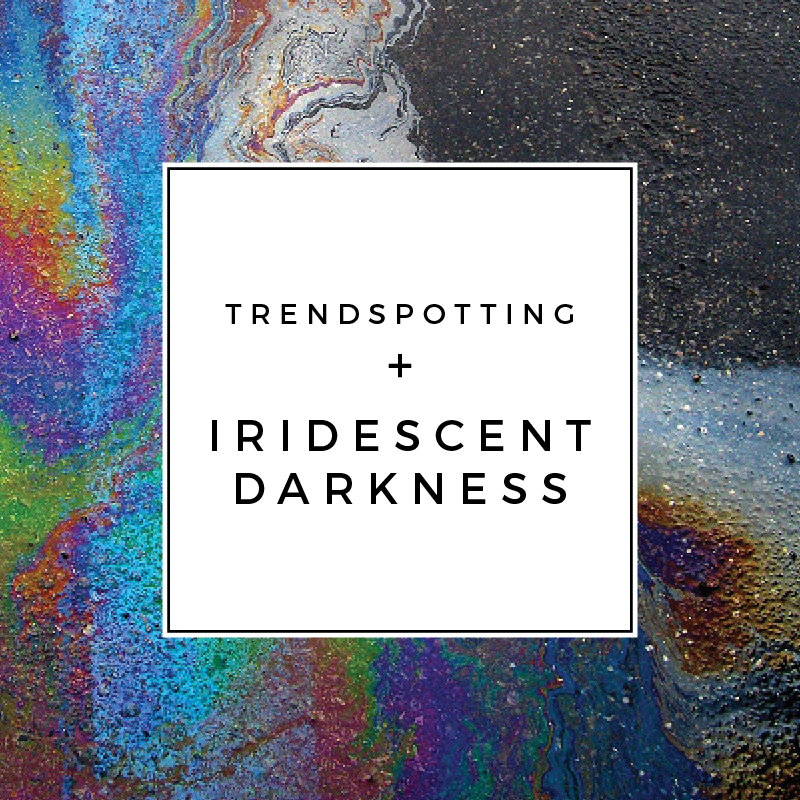
 

Trendspotting + Iridescent Darkness

Purple rain and dark, rock and roll iridescence has been stuck in my head on repeat for days now. I love the ’80s glam-ness of this retro-fresh trend. Do you guys fall down Instagram rabbit holes, too? ‘Cause Tom Dixon has been using #tdiridescence to promote his new Oil and Warp collections and the tag is quite inspirational.

04-25_Trendspotting+Iridescence_dark

oil on asphalt (above) / oil on asphalt (below) / Frends Headphones, Taylor Oil Slick / Casamance, The Parallel linen wallcovering / Kate Spade New York, Glitter Stud Earrings in Multi Glitter / Tom Dixon Warp Vase / barber scissors / rug, Linie Design, Grace in Purple / Starbucks stainless steel cold cup / Skye Oil Slick Hologram Bikini / iridescent effects on metal

Light, bright iridescent is also having a moment (hello unicorns and rainbows!!). Check back here on Wednesday for my Iridescent Lightness mood board!

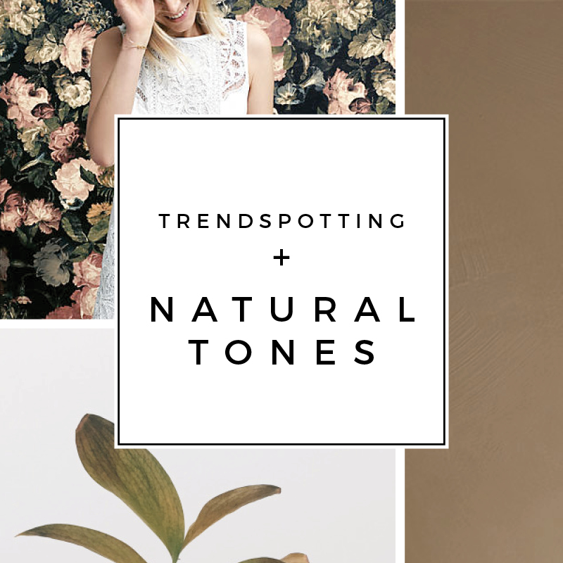
Trendspotting + Natural Tones

07-04-2016_Trendspotting+NaturalTones_2

shift dress / Tom Dixon brick diffuser / LADY Minerals chalk paint in rustikk terracotta

You know how sometimes one color just dominates trends forever that you almost don’t even see it. Then something new comes along.

It seems like we’ve been living in gray and white city for a few years design wise. It’s become ‘safe’ and it’s just about time to mix things up. Shake off the gray skies and let some spring time nature in!

I’m so excited to see browns and neutrals sneaking in to the latest offerings of fixtures and furnishings. Lovely, solid, natural greens seem to exude that perfect a fresh pop of newness and light. My particular favorite is that perfect medium brown leather, like a warm cognac, slightly distressed and with green undertones.

07-04-2016_Trendspotting+NaturalTones

H&M Home patterned pillows  /  IKEA Sannolik vase in pink  /  Tubéreuse large candle indoor + outdoor edition  /  Rowan pendant  /  West Elm Hamilton leather sofa in Brooklyn Candle Studio’s home  /  Pottery Barn leather pillow  /  plant  /  LADY Minerals chalk paint in cashmere

Trends + 2015 >> Part 2

Today I’ve got part 2 of my trend report for you. In case you missed it, check out part 1 here.

00_collage-trends2015_neons_686w

1 / 2 / 3 / 4

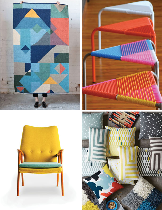
Along with all these soft pastels and bold darks I was talking about last week, I think were going to be seeing more Neon and especially bright yellow. I think there is a serious shift away from grey on grey and we’re also going to be seeing the grey-ness come out of our colors. With the muddy-ness gone, the bold neons will shine bright and happy. I am especially excited about the just announced Kate Spade Saturday + West Elm collection (see the pillows above). (Also, did ya’ll spot the backgammon board peaking out? That’s the Luxe Gaming trend I’m talking about in Part 1!)

00_collage-trends2015_facets_686w

1 / 2 / 3 / 4

Next up is Facets + Brutalism. I’ve started to see a shift away from regular geometrics, like hexagons, and into more faceted irregular geometrics. I think were going to see the trend start to look like precious gems but also deconstructed, hard edged pieces like this light fixture from Jason Kohairk. And that brutalism can be traced back to Nordic design with their harsh winters and stoic Vikings.

00_collage-trends2015_dots+braids_686w

1 / 2 / 3 / 4 / 5 / 6

Lastly, and on a softer note, I think we’re going to see a lot of Tassels, Dots + Fringe this next year. I’ve been seeing tassels and pompoms pop up all over the DIY scene (I’m loving this cute bag) and I think it’s finally translating into home decor like in the chandelier from PB Kids above. I think this is a logical transition from all the ’70s macrame of last year to something more authentically current though still handmade. If you’re looking for Nordic-ness in this trend, look no farther than the iconic Marimekko Räsymatto pattern. And even more Scandinavian? The awesomely intricate braids everyone’s been rocking lately. I think I’m going to call this trend report done and go braid my hair now.

// in other news

One of my very favorite Minted designs, Heart Stripe, won an Editor’s Choice award last week! I was so excited to get the news and I’ll be sure to share with you guys when it goes up for sale. Thank you to everyone who voted!! You guys rock.

Right now I have three set of Minted items are up for vote (including the fabric I mentioned last week). Check out my Minted Challenge // voting board on Pinterest for what is active (or my // everything board if your curious about all my work for Minted). Vote-able links are also below! Thank you so much for your support.

Art Work   1 / 2 / 3 / 4

Fabric   1 / 2 / 3 / 4 / 5 / 6

Birth Announcements   1 / 2 / 3

Trends + 2015 >> Part 1

I was going to give you a really awesome DIY today. I was. But it didn’t turn out awesome. Sometimes that happens. I’m going to work on it a bit more and come back with something even better next week.

Instead I’m going to share my trend report for 2015 that I’ve been working on. Here’s what what I’m seeing for the new year!
00_collage-trends2015_scandibold_686w

1 / 2 / 3 / 4

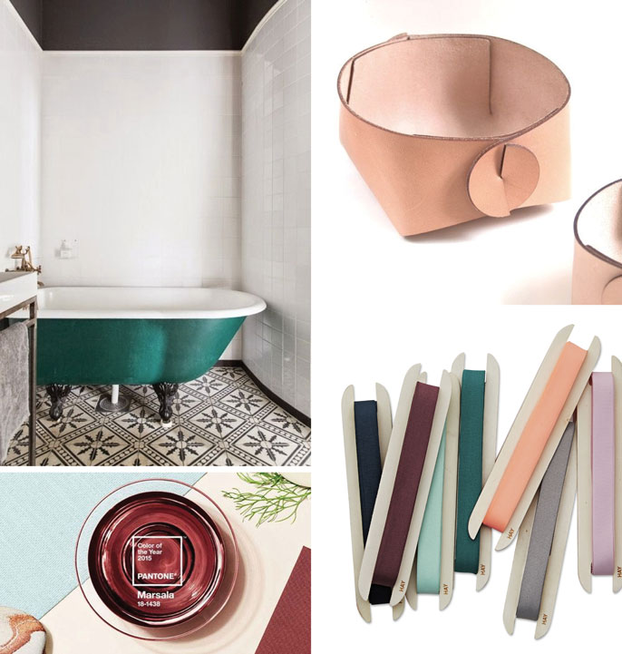
First up, and I think influencing all the other trends below, is Scandinavian Bold. I promise this is not just because I’m living in Sweden and surrounded by Scandinavian design. This trend is getting big! Pantone has selected a wonderfully deep red for color of the year, then paired it with pastels and nudes in the Scandic tradition. And I’ve been seeing deep greens and emeralds popping up as well. Pastels, nudes and black + white go great with these bolds and speak to the starkness of Nordic living. You can see this in the new lines for Hay, Ferm Living and even West Elm.


00_collage-trends2015_luxegaming_686w

1 / 2 / 3

Luxe Gaming is just starting to trend. I feel like people are starting to want to unplug a bit from their iphones and spend real time with friends again. We started hosting game night this winter, but I know we are not the first or the only ones to be throwing a dice (or pig). The popularity of Cards Against Humanity and One Night Ultimate Werewolf definitely speak to this trend. I think we’re seeing this manifest in interiors with games displayed along side books (like ours are here) and also in new patterns, like this wallpaper.


00_collage-trends2015_pastels+nudeleathers_686w

1 / 2 / 3 / 4

Pastels + Nude Leather are a subset of the Scandinavian trend. It’s not just for spring time and little girls’ and boys’ rooms anymore. I’ve seen it popping up in furniture and accessory design and I think we’re going to see more of it, mixes in with bold colors, in 2015.

That’s it for now. Stay tuned and next Tuesday I’ll post Part 2.

If your curious about my 2014 trend report check out Part 1 and Part 2 here.

about

Hello! I’m an interior, user experience, and graphic designer with a love for purpose-driven minimalism. I am also a digital nomad originally from California, currently living in Barbados, by way of Colorado, with my husband and our two cats.

FOLLOW ALONG

  • Instagram
  • LinkedIn
  • Pinterest

just what you’re looking for

© Cindy Lackey | Site design handcrafted by Station Seven